
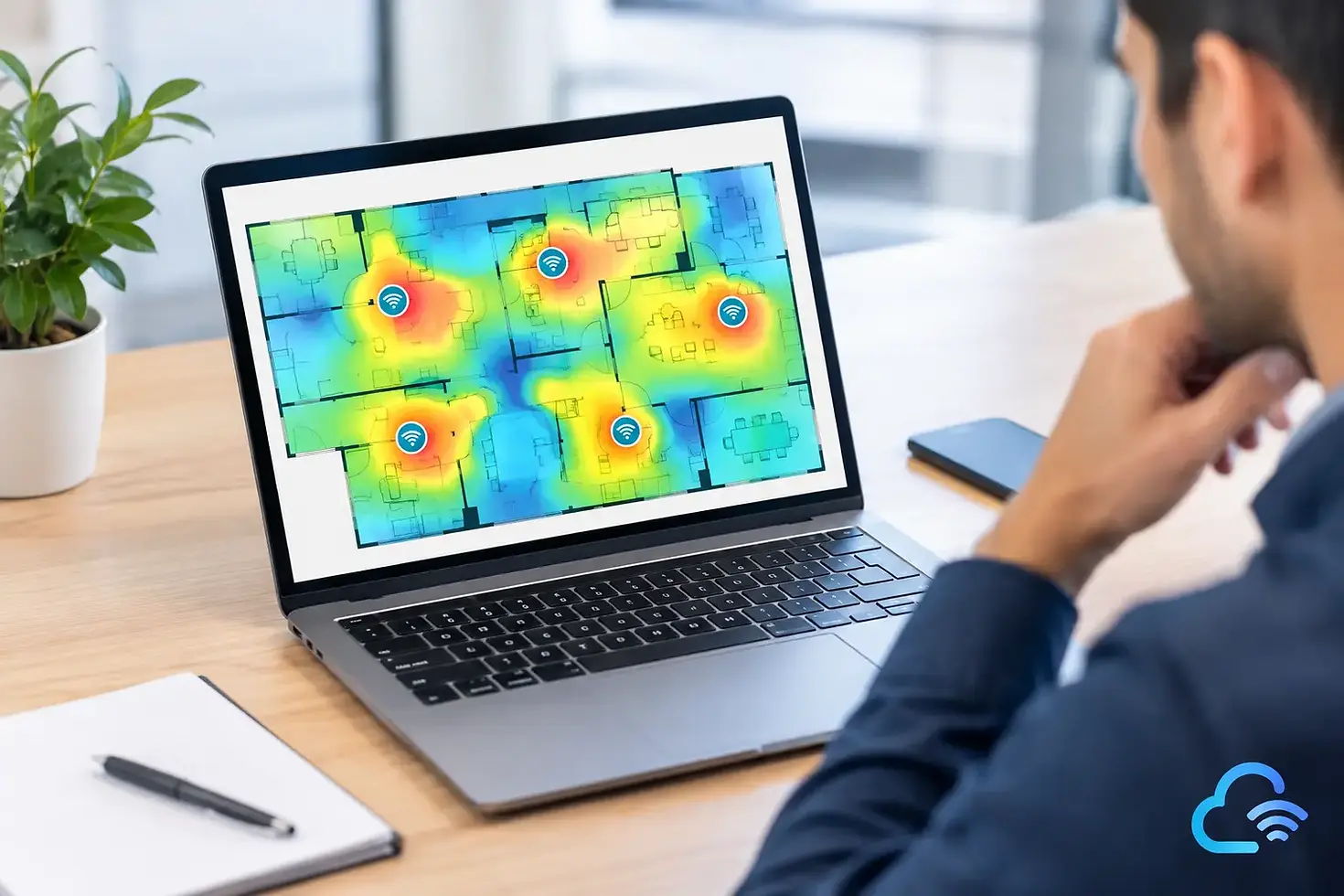
WiFi Heatmap Interpretation Guide for Networks
A Wi-Fi heatmap can make a complex RF environment look deceptively simple. A patch of green may suggest good coverage, while a red corridor appears to identify the problem. In practice, a useful wifi heatmap interpretation guide must go further: it must distinguish coverage from capacity, signal strength from signal quality, and a design assumption from measured performance.
For IT teams responsible for business-critical wireless, the objective is not to create an attractive floor plan. It is to determine whether users, devices, and applications can perform reliably in the spaces where work actually happens. That requires reading multiple heatmaps together and relating them to defined requirements.
Start With the Survey Context
Before interpreting colors, confirm what created the map. A predictive design heatmap estimates RF behavior from floor-plan scale, construction materials, access point placement, antenna patterns, and configured power levels. It is valuable for planning, but it is still a model. Unidentified building materials, furniture, storage racks, glass, people, and neighboring networks can materially change the live result.
An active survey measures the wireless connection from the client device while associated to the network. It can show practical outcomes such as throughput, roaming behavior, packet loss, and retry activity. A passive survey captures RF activity across the air and is especially useful for identifying access points, channel use, interference, and noise. The most dependable validation approach combines them when the environment and project scope justify it.
Also verify the survey settings. A heatmap is only meaningful when the survey was collected with the correct floor-plan scale, AP inventory, radio configuration, and client assumptions. For example, a map collected with a high-gain survey adapter may look healthier than the experience of a handheld scanner or standard laptop.
WiFi Heatmap Interpretation Guide: Read the Core Metrics Together
No individual metric can certify a wireless network. Signal strength, signal-to-noise ratio, overlap, and channel conditions should be evaluated as a set, using the requirements of the application and device population.
Signal strength answers: Can the client hear the AP?
Received signal strength indicator, usually shown as RSSI in dBm, is the most familiar heatmap metric. Values closer to zero are stronger. As a general business Wi-Fi planning reference, -67 dBm is commonly used as a minimum target for dependable data, voice, and many mobile workflows. Some higher-density or latency-sensitive environments may require -65 dBm or better. Basic low-demand connectivity may tolerate less.
A signal heatmap that shows widespread green does not automatically prove the network is ready. A client might hear an AP at -67 dBm while still experiencing a weak return path, contention, interference, or poor roaming decisions. Treat RSSI as a coverage baseline, not a final acceptance test.
Pay close attention to the edges of usable areas, enclosed rooms, stairwells, elevators, loading areas, and perimeter offices. These are common locations for marginal coverage. A small weak-signal region may be acceptable if it is outside the operational area. The same region is a priority if it contains point-of-sale devices, warehouse scanners, clinical equipment, meeting rooms, or security systems.
SNR answers: Is the signal usable above the noise?
Signal-to-noise ratio compares received Wi-Fi signal with the RF noise floor. It often reveals problems that an RSSI map hides. An area can have a strong signal but poor SNR when electrical equipment, non-Wi-Fi RF sources, or elevated background noise degrade the channel.
For many enterprise applications, an SNR of 25 dB or greater is a practical planning target. Voice, real-time collaboration, and high-performance clients may benefit from 30 dB or more. Lower values can lead to reduced modulation rates, retries, inconsistent application response, and unstable connections.
When SNR is poor, adding an AP is not always the answer. More APs can raise co-channel contention if the underlying issue is noise or channel reuse. Investigate the noise source, validate channel assignments, and review transmit-power settings before expanding the design.
Secondary coverage answers: Can the client roam predictably?
A secondary coverage heatmap shows whether a second eligible AP is available above a chosen threshold. This matters where clients move between coverage cells and need to roam without extended disruption. Voice handsets, barcode scanners, healthcare devices, and mobile collaboration endpoints are common examples.
The target depends on the client and application. A design may require two APs at or above -67 dBm across the service area, while a less mobile office environment may use a different threshold. The key is consistency: use the same documented requirement in design, validation, and remediation discussions.
More overlap is not automatically better. Excessive overlap on the same channel can create co-channel interference, where devices must contend for airtime. Good roaming design requires intentional overlap from access points using appropriate channels, not simply stronger RF everywhere.
Channel and co-channel interference answer: How busy is the RF neighborhood?
Channel-related heatmaps show whether nearby APs are using channels that compete with one another. In 2.4 GHz, the limited number of non-overlapping 20 MHz channels makes careful channel reuse essential. In 5 GHz and 6 GHz, additional spectrum provides more options, but channel planning, client support, and regulatory settings still matter.
High co-channel interference does not necessarily mean a radio fault. It can occur in a dense deployment where too many APs use the same channel within mutual hearing range, where transmit power is too high, or where a neighboring tenant operates unmanaged wireless. The remediation might be a channel plan adjustment, lower transmit power, AP relocation, or a capacity redesign.
Avoid judging channel health solely from the number of visible networks. What matters is their signal level, airtime impact, channel relationship, and whether they are active during the period that users report problems.
Use Color Thresholds Carefully
Heatmap colors are communication tools, not universal performance grades. Green at -67 dBm may represent acceptable coverage for one project but insufficient coverage for another that requires -60 dBm. A map can appear mostly green simply because its thresholds were set too generously.
For every survey deliverable, document the pass/fail thresholds used for RSSI, SNR, secondary coverage, channel overlap, and application-specific results. Align them with the customer’s requirements before interpreting results. This makes acceptance testing defensible and avoids debates based on color alone.
It is also worth checking the legend on every exported image. Teams often compare heatmaps from different surveys without realizing that the color scale or minimum threshold changed between reports. The visual comparison can then be misleading even when both maps are technically accurate.
Turn Problem Areas Into Targeted Actions
The strongest value of a heatmap is its ability to narrow troubleshooting and investment decisions. Start with locations where poor user experience, help desk tickets, or critical workflows overlap with a failing RF metric. Then identify the pattern.
A weak RSSI and weak secondary coverage result may point to AP placement, building attenuation, or insufficient coverage. Strong RSSI with low SNR suggests noise or interference. Good RSSI and SNR with poor throughput can indicate airtime contention, WAN limitations, authentication delays, packet loss, or a client issue. Heatmaps identify where to investigate, but packet analysis, infrastructure monitoring, and active testing may be needed to establish why.
When changes are required, model and validate them rather than relying on intuition. Moving an AP a short distance, changing antenna orientation, reducing channel width, or adjusting transmit power can improve one area while degrading another. Tools such as Ekahau support this iterative planning and validation process by connecting floor-plan design decisions with measured RF data.
Common Interpretation Mistakes
The most frequent mistake is treating maximum signal strength as the goal. Very strong AP signals can encourage sticky clients, increase co-channel contention, and obscure a poorly balanced design. The goal is usable, well-managed coverage that meets the agreed performance target.
Another mistake is evaluating only 2.4 GHz because it reaches farther. Many modern business environments depend primarily on 5 GHz and increasingly 6 GHz for capacity and performance. A successful survey should assess the bands, channel widths, client capabilities, and SSIDs that the organization will actually use.
Finally, do not validate an empty facility and assume the result will hold during normal operation. Warehouses fill with inventory, conference rooms fill with people, and offices gain monitors, partitions, and neighboring RF activity. Where practical, survey under representative conditions and schedule follow-up validation after major layout or occupancy changes.
A heatmap becomes operationally useful when it is tied to a documented requirement, a realistic client profile, and a corrective action the team can verify. That discipline turns colored floor plans into evidence for better wireless decisions.


Comments